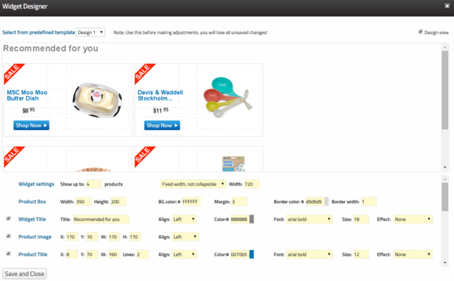
How to Design the Perfect Recommendations Widget
Step 1 - Select from the predefined templates. This should be done before adjusting the widgets as selecting a fresh template deletes all adjustments.
Step 2 - Adjust the look and feel, add labels - buttons or badges if needed.
Step 3 - Save and close the widget designer.
Important ! The design is not saved until you save the rule containing it!
Design View
You can switch design view on and off with the checkbox at the top right. design view shows the area of each content piece with a wireframe and also the labels, including those which are set to show on specific products (new, best sellers etc..).
How to Create Call to Action Buttons
Use a label. Select the button from the predefined images.
Then add text like "BUY NOW" and use white color and center align.
Adjust the size and location.
Uploading Your Own Graphics
You can use your own labels by inserting their url to the Optional Image Url: boxes. Reusing graphics from your site will make the design quick and easy.
Widget Layout
You can select a fixed width widget or a responsive one.
To determine the number of columns adjust the widget width parameter. Remember there is margin between the widget items so you may need to increase it accordingly.
Show On Functionality
Labels can be set to show only on products flagged as new, best sellers, or sale items. This information is usually taken from your product feed. Before using, custom setup has to be performed from Barilliance side.
Incorporating Dynamic Image
To add a product specific image such as star rating or brand logo, Click 'predefined' on one of the labels and select Custom Image. Before using, custom setup has to be performed from Barilliance side. Please contact Support@barilliance.com for assistance with this.
